Anscombe's quartet
Anscombe's quartet comprises four datasets that have identical simple statistical properties, yet appear very different when graphed. Each dataset consists of eleven (x,y) points. They were constructed in 1973 by the statistician Francis Anscombe to demonstrate both the importance of graphing data before analysing it and the effect of outliers on statistical properties.[1]
For all four datasets:
| Property | Value |
|---|---|
| Mean of x in each case | 9 (exact) |
| Variance of x in each case | 11 (exact) |
| Mean of y in each case | 7.50 (to 2 decimal places) |
| Variance of y in each case | 4.122 or 4.127 (to 3 decimal places) |
| Correlation between x and y in each case | 0.816 (to 3 decimal places) |
| Linear regression line in each case | 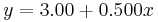 (to 2 and 3 decimal places, respectively) (to 2 and 3 decimal places, respectively) |
The first one (top left) seems to be distributed normally, and corresponds to what one would expect when considering two variables correlated and following the assumption of normality. The second one (top right) is not distributed normally; while an obvious relationship between the two variables can be observed, it is not linear, and the Pearson correlation coefficient is not relevant. In the third case (bottom left), the distribution is linear, but with a different regression line, which is offset by the one outlier which exerts enough influence to alter the regression line and lower the correlation coefficient from 1 to 0.82. Finally, the fourth example (bottom right) shows another example when one outlier is enough to produce a high correlation coefficient, even though the relationship between the two variables is not linear.
The quartet is still often used to illustrate the importance of looking at one's data graphically before starting to analyze, and the inadequacy of basic statistic properties for describing realistic datasets.[2][3][4][5][6]
The datasets are as follows. The x values are the same for the first three datasets.[1]
| I | II | III | IV | ||||
|---|---|---|---|---|---|---|---|
| x | y | x | y | x | y | x | y |
| 10.0 | 8.04 | 10.0 | 9.14 | 10.0 | 7.46 | 8.0 | 6.58 |
| 8.0 | 6.95 | 8.0 | 8.14 | 8.0 | 6.77 | 8.0 | 5.76 |
| 13.0 | 7.58 | 13.0 | 8.74 | 13.0 | 12.74 | 8.0 | 7.71 |
| 9.0 | 8.81 | 9.0 | 8.77 | 9.0 | 7.11 | 8.0 | 8.84 |
| 11.0 | 8.33 | 11.0 | 9.26 | 11.0 | 7.81 | 8.0 | 8.47 |
| 14.0 | 9.96 | 14.0 | 8.10 | 14.0 | 8.84 | 8.0 | 7.04 |
| 6.0 | 7.24 | 6.0 | 6.13 | 6.0 | 6.08 | 8.0 | 5.25 |
| 4.0 | 4.26 | 4.0 | 3.10 | 4.0 | 5.39 | 19.0 | 12.50 |
| 12.0 | 10.84 | 12.0 | 9.13 | 12.0 | 8.15 | 8.0 | 5.56 |
| 7.0 | 4.82 | 7.0 | 7.26 | 7.0 | 6.42 | 8.0 | 7.91 |
| 5.0 | 5.68 | 5.0 | 4.74 | 5.0 | 5.73 | 8.0 | 6.89 |
A procedure to generate similar data sets with identical statistics and dissimilar graphics has since been developed.[7]
References
- ^ a b Anscombe, F. J. (1973). "Graphs in Statistical Analysis". American Statistician 27 (1): 17–21. JSTOR 2682899.
- ^ Elert, Glenn. "Linear Regression". The Physics Hypertextbook. http://physics.info/linear-regression/practice.shtml.
- ^ Janert, Philipp K. (2010). Data Analysis with Open Source Tools. O'Reilly Media, Inc.. pp. 65–66. ISBN 0596802358.
- ^ Chatterjee, Samprit & Hadi, Ali S. (2006). Regression analysis by example. John Wiley and Sons. pp. 91. ISBN 0471746967.
- ^ Saville, David J. & Wood, Graham R. (1991). Statistical methods: the geometric approach. Springer. pp. 418. ISBN 0387975179.
- ^ Tufte, Edward R. (2001). The Visual Display of Quantitative Information (2nd ed.). Cheshire, CT: Graphics Press. ISBN 0961392142.
- ^ Chatterjee, Sangit; Firat, Aykut (2007). "Generating Data with Identical Statistics but Dissimilar Graphics: A Follow up to the Anscombe Dataset". American Statistician 61 (3): 248–254. doi:10.1198/000313007X220057.